Designing powerful communication with interactive infographics
Modern interactive information design has become a prime component of communication design, helping to make content more accessible, engaging, and memorable.
Since 2012 we have designed and implemented all kinds of interactive infographics for a global audience.

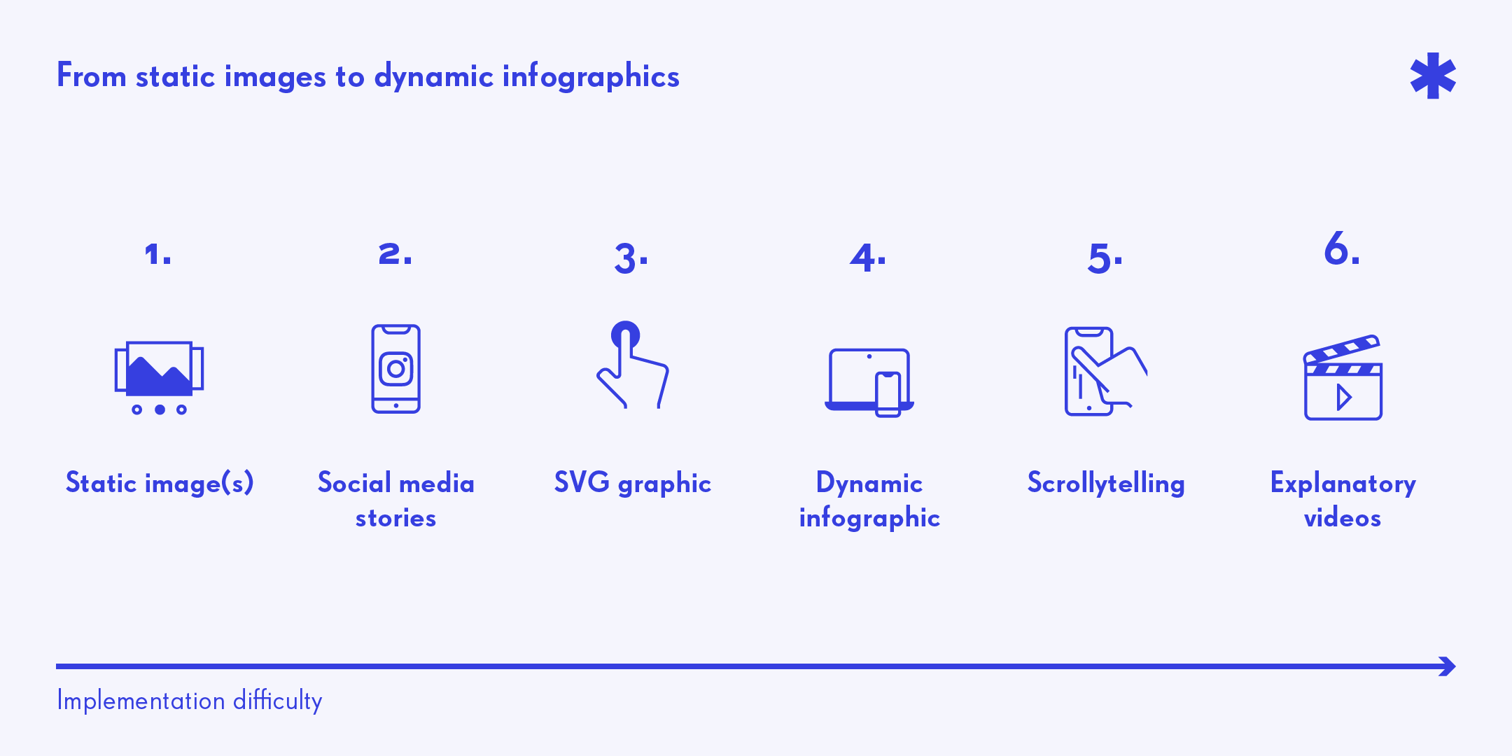
Digital infographics vary from static images and galleries, to inline SVGs and custom code, dashboards with customizable data-sets, up to complex scrollytelling websites. We will now explore different kinds of approaches with real examples of work done.
How to start?
There are incredible possibilities in the world of modern interactive information design. A solid UX research, the right questions and a technical assessment can help you find the right direction:
What is my primary target group? What do they need? And how is their online behaviour?
In which technical framework will my project be placed? What is the expected scaleability? Which resources are available? And what level of complexity can be reached?
1. Dashboards
A dashboard is commonly understood as a centralized location for multiple data visualizations on the same topic. This enables users to analyse the data personally and to filter and tweak the visualizations to one’s needs. A charting library connected to a centralized data source is used to provide this functionalities.
Common frameworks are tableau, highcharts, datawrapper and d3.
2. Illustrative infographics
Illustrations are the main elements to help convey information visually: they vary from icons to figures and objects to complex sceneries and 3D imagery. This approach is usually best to explain processes and/or visualise categories, hierarchies and relationships to an audience who is not interested in a direct analysis, but rather wants to be told a story.
3. Scrollytelling
Scrollytelling refers to longer text articles with multimedia content being triggered by scrolling. It is commonly used for longer and multi faceted stories with a strong narrative. They use the default scrolling behaviour of websites to animate successive blocks of mixed media content. It is important to research possibilities and examples from around the web so you can support your developer and designer as much as possible.
Common frameworks are:
- Shorthand: no programming knowledge required
- the Lottie workflow: After Effects knowledge required
- ScrollMagic or ScrollTrigger: programming knowledge required
In the gallery at the end of the article you can find examples to the above mentioned categories.
Crossmediality
Interactive infographic projects have one thing in common: they are based on the SVG format. This is great news for crossmediality, allowing us to quickly adapt the product for other digital channels or for print.
If you are interested in learning more about how to make these products, we provide consultations as well as private workshops. Or you can join our next »Infografik Digital« Workshop in collaboration with PAGE Academy and Sapera Studios.
Rights of projects
Projects marked with a [1] were developed while working for Sapera Studios and are their copyright.
Projects marked with a [2] were developed while working for Lucid. Studio and are their copyright.
Links to mentioned projects
donortracker.org [2]
StrahlenschutzFokus: Radiologischer Notfall [1]
StrahlenschutzFokus: Radon [1]
StrahlenschutzFokus: BeVoMed [1]


