Designing an interactive map based website
Website with an interactive map that gives an overview of the cultural offering in the Berlin neighbourhood of Lichtenberg. The goal was to change the perception of the district Lichtenberg and make its vivid arts scene visible.
Made for the District Authority Lichtenberg of Berlin, Office for Further Education and Culture.

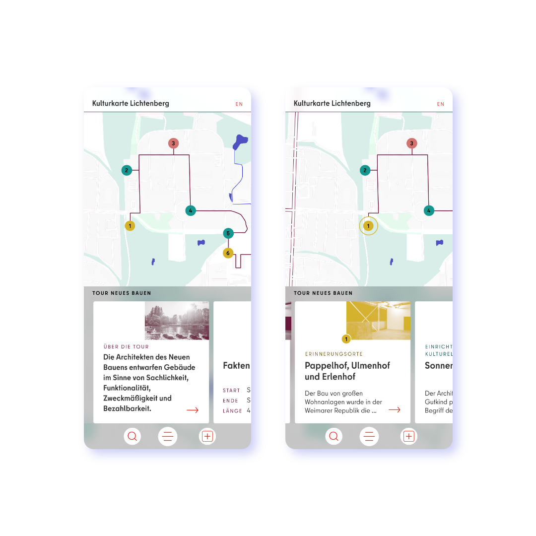
We designed an interactive map that gives an overview of the cultural offering in the Berlin neighborhood of Lichtenberg. Each offer is positioned on the map with a pin which is clickable and opens up further information. Our client’s goal was to change the perception of the district of Lichtenberg and make its vivid arts scene visible.
The client was involved throughout the design process. Starting with a design click dummy through to specifically developed scorecards, we made it easy for them to evaluate the user experience and make democratic decisions between different designs.
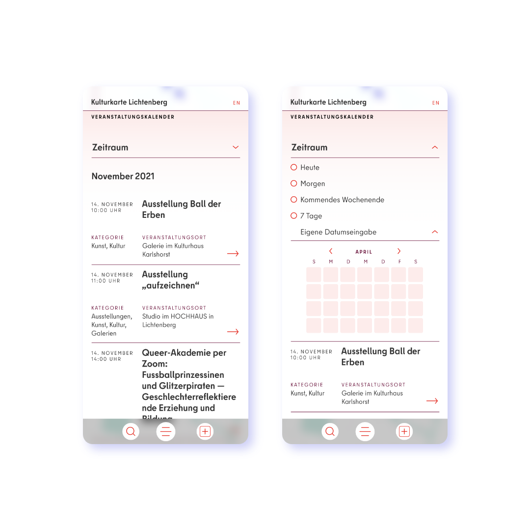
A keyword-based search function complements the map interface; both allow the user to find content independently of the device being used. All our web designs are user-centric, accessible, and responsive. The colors used in the map are optimized for people with impaired vision, which is especially important as the types of cultural locations and events are color coded.
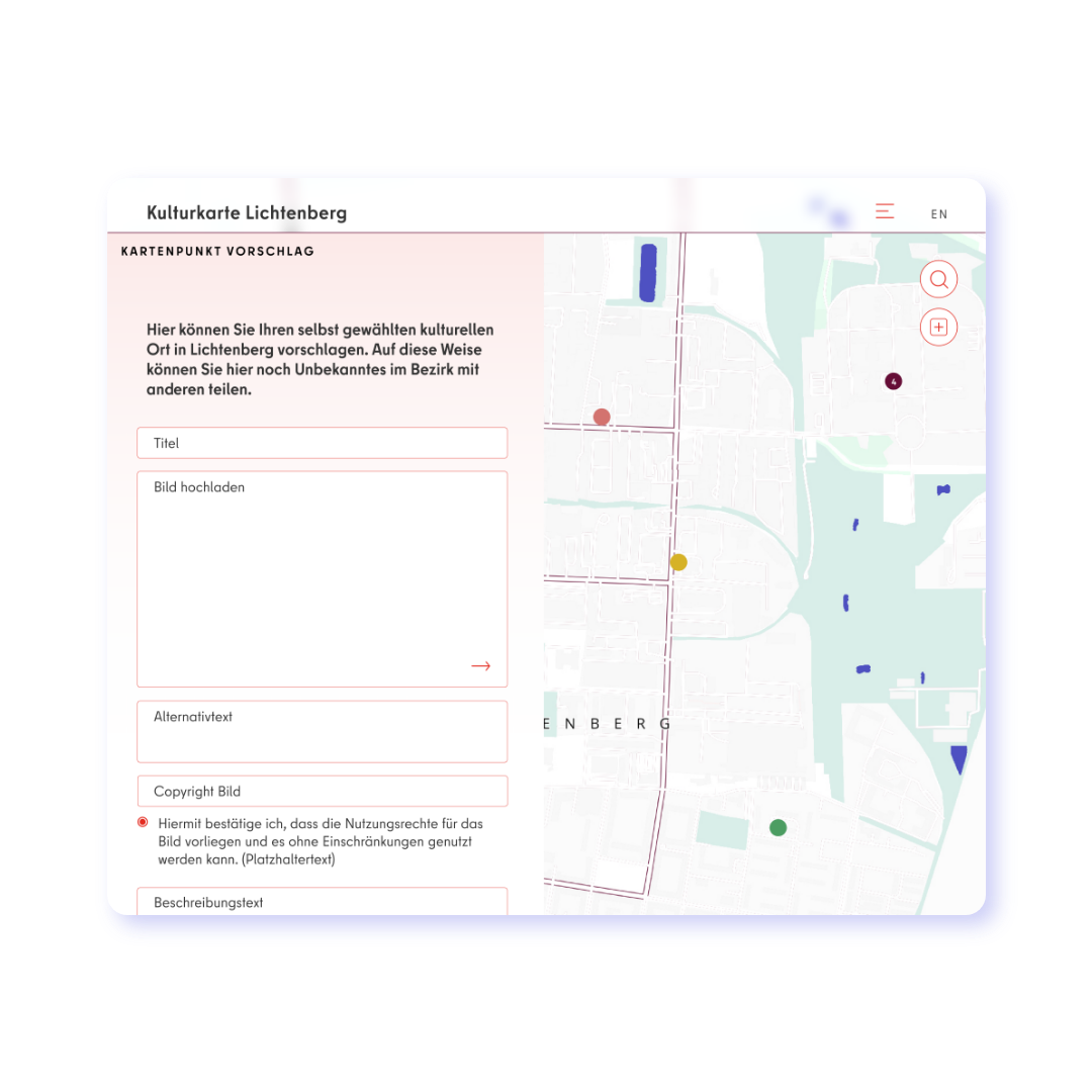
A great feature of the website is that users are able to suggest new map entries through a simple online form. This can be approved or sent back for editing by the client with a simple click. We always consider the administrative effort our clients will need to run their projects and design according to the available resources. This is the basis for successful and sustainable digital products.
Client
District Authority Lichtenberg of Berlin, Office for Further Education and Culture
Collaboration partners
Concept: black flamingo
Programming: Digitale Strategieberatung Vincent Van Uffelen
Link to project