Designing the future of interdisciplinary energy research
The new NFDI4Energy website was overhauled both visually and structurally, presenting the consortium in a modern, professional and inviting manner. NFDI4Energy is the central point of contact for Research Data Best-Practices in the field of Energy and belongs to the wider German NFDI Programme.
Made for NFDI4Energy.

NFDI4Energy is one of 26 consortia belonging to the National Research Data Infrastructure (nfdi.de). NFDI aims to systematically unlock, connect, and preserve valuable data resources for long-term use in the German research system, improving their usability and exchangeability. This ensures data is made available according to the FAIR principles.
The relaunch was comprehensive: from a new CMS, to a target-group oriented website structure and an accessible design.
In various workshops with multiple departments of NFDI4Energy, we analysed design elements, target groups, user flows, content types, targets and goals to develop a strategy for the development of the website.
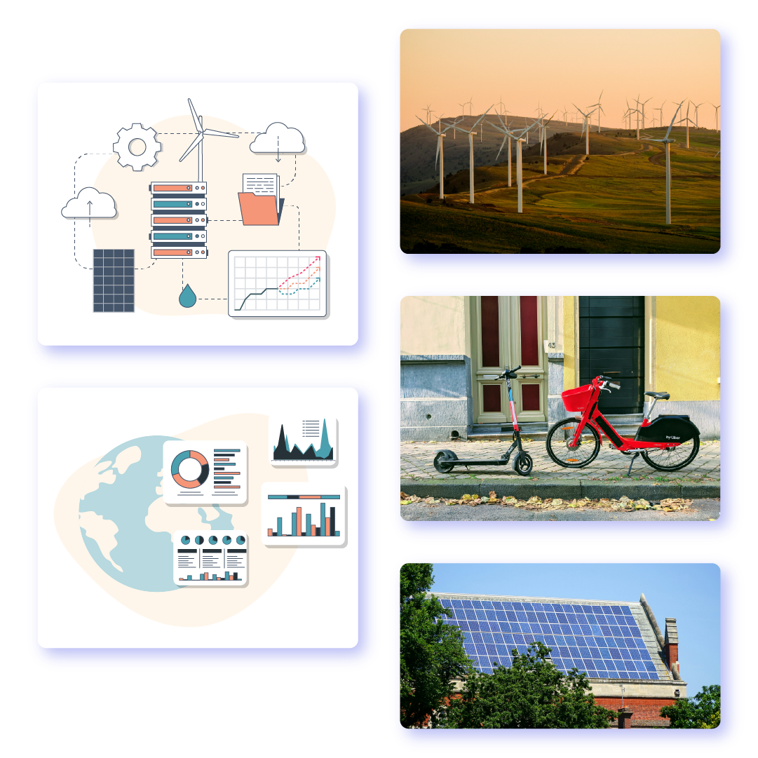
The design was updated and developed to serve a modern digital platform with high accessibility standards. The color palette was extended, and color coding and combinations analysed. A fitting font-based icon-set and open-source illustrations were researched and used for the user interface and hero sections. The font chosen is the Hyperlegible Atkinson Font, made for optimal legibility.
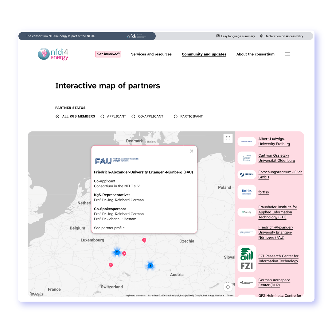
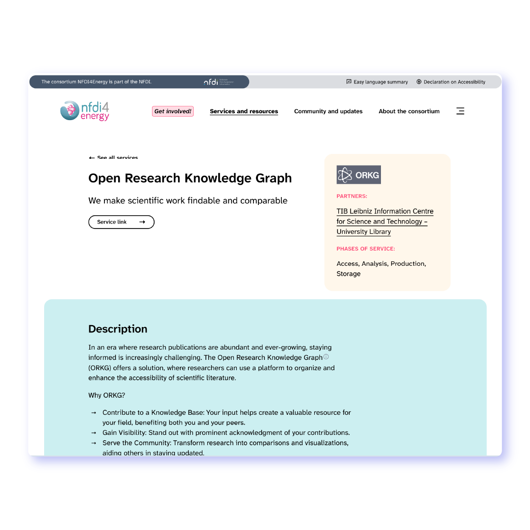
The website is a use-case for accessibility best-practices, meeting standards in WCAG 2.1, 2.2 and BITV2.0. It offers its users a wide range of content, simply structured and easy-to-find, while being optimised for Search Engines and AI bots. The modular approach and open-source CMS allow its staff to have maximum flexibility in creating and designing content; An internal How-to guide, setup directly as a microsite inside the CMS, allows for quick access and acts as a centralised point of reference.